Fonts for Your Custom Coat of Arms and Crest
Basic Rule of Design: No More Than Two Fonts In One Design
We recommend that you use 1-2 fonts (maximum) in your custom design.
More font styles just make the design seem disjointed.
We can use any font you wish, but if we must purchase a particular font for your design -- one that you have selected that is not in our collection -- that cost will usually be passed on to you.
Keep in mind that some fonts are very difficult to read in all caps, such as Engravers Old English. Other fonts don't have upper case letters at all, such as Libra.
Please be careful; download fonts only from web sites that you are sure you can trust.
Not sure which fonts to use? Just let our artists suggest the fonts for your design.

These are some of the fonts that are very popular, especially for our custom coat of arms and crest designs:
(Please note that these fonts are copyrighted and only listed here for the convenience of our clients.)

Other Topics
Can I see some examples of your design work?
Of course! Please see our portfolio and pick some examples that you would like your design to emulate.
What if I want to have the design embroidered on clothing and accessories?
Color and detail in a digital design can look very different when converted to an embroidery format. Please see our web page about embroidery services: Embroidery
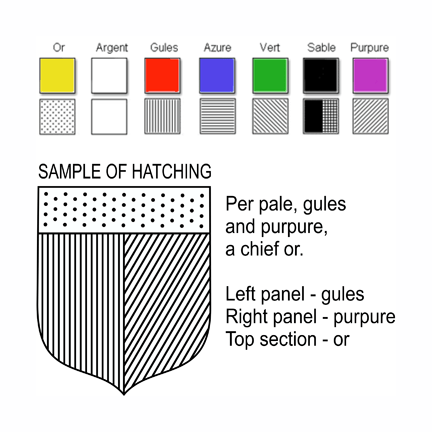
Why do some coats of arms have lines and dots?
This is called "hatching" and was used by jewelers and other artists when color was too expensive to use or unavailable.
What is Hatching?
"Hatching" is the term for representing the colors of a coat of arms in black and white. This was necessary when color printing was excessively expensive.


